Colours can speak volumes without uttering a word. They can calm you, energize you, or even spark creativity. Whether you’re redecorating a single room or doing a full home makeover, choosing the right colour combination is an art we’ll help you master.
1. Navy Blue & Crisp White
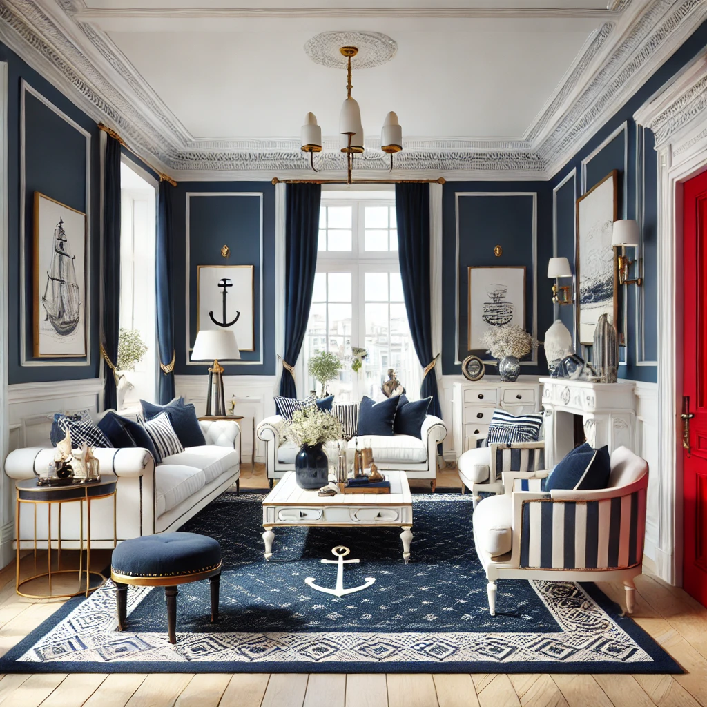
- Why It Works: The classic nautical pairing of deep navy and bright white is timeless, providing a crisp, clean look. White trim frames the navy façade, creating striking contrast.
- Finishing Touches: Consider a bold red or brass door for a pop of accent colour.
2. Sage Green & Soft Gray
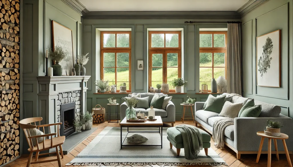
- Why It Works: These muted tones complement natural surroundings, perfect for homes near greenery or rural landscapes. Sage green feels soothing, while the soft gray trim keeps things modern.
- Finishing Touches: Add rustic stone accents or wooden shutters to highlight the home’s natural charm.
Also Read: 15 Green Color Combinations for Home Interiors
3. Charcoal Gray & Tan
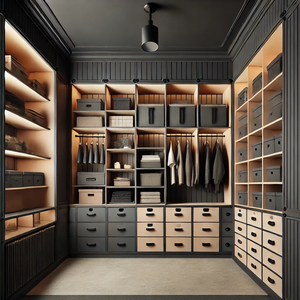
- Why It Works: A deep, sophisticated charcoal provides a contemporary edge, while tan or beige trim warms up the overall look. This combination suits modern suburban homes or sleek urban builds.
- Finishing Touches: Pair with matte black hardware and light fixtures for extra polish.
4. Terracotta & Cream
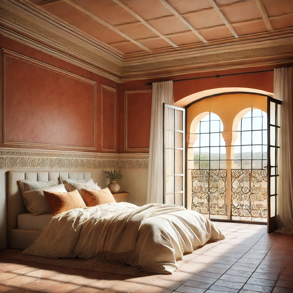
- Why It Works: Inspired by Mediterranean villas, terracotta exudes warmth and character. Cream trim brightens the façade and keeps the palette from feeling too heavy.
- Finishing Touches: Add ornate metal railings or terracotta roof tiles for an authentic, sun-kissed feel.
5. Forest Green & Taupe
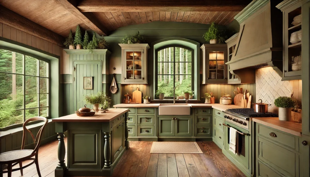
- Why It Works: Rich forest green merges beautifully with a taupe or khaki trim, creating a balanced, earthy vibe. This palette complements wooded surroundings or cottage-style architecture.
- Finishing Touches: Consider shutters in a darker shade of brown or black for subtle contrast.
6. Pale Yellow & White
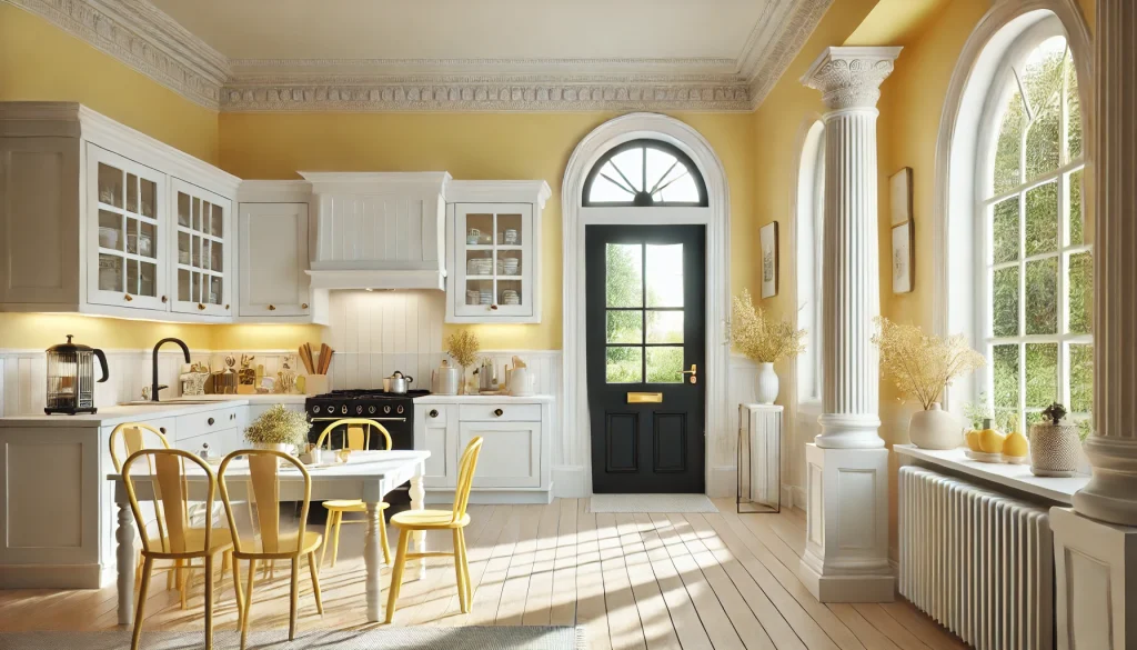
- Why It Works: Soft pastel yellow radiates a cheerful, inviting charm. Crisp white on the trim, columns, and railings brightens it all up for a quintessentially cozy look.
- Finishing Touches: Try a glossy black front door to add a modern pop.
Also Read: Small Modular Kitchen Design Ideas for Indian Homes
7. Brick Red & Cream
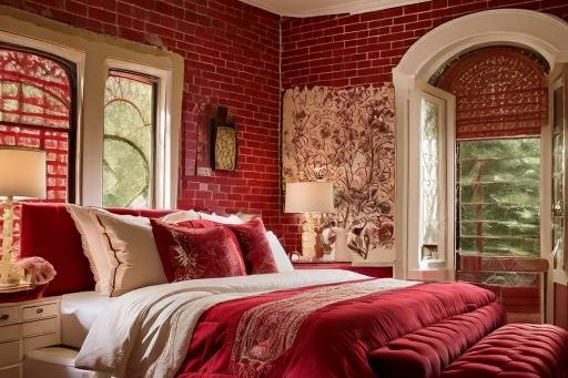
- Why It Works: A deep brick red nods to traditional craftsmanship, pairing beautifully with lighter cream trim. It’s an ideal choice for colonial-style or farmhouse exteriors.
- Finishing Touches: Consider stone or brick detailing to enhance the classic appeal.
8. Modern White-on-White
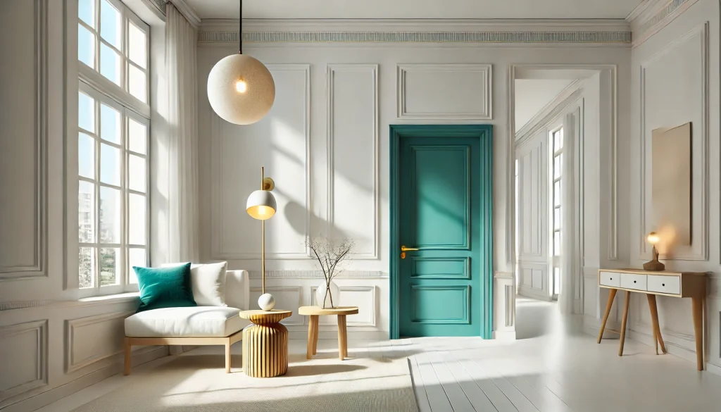
- Why It Works: Layering multiple shades of white offers a clean, minimalist aesthetic. Think crisp bright white walls with slightly warmer white trim for subtle dimension.
- Finishing Touches: Add textured wood accents or a statement door in a bright hue to break up the monochrome.
Read More: 24 Bedroom Colour Combination Ideas
9. Light Gray & Black
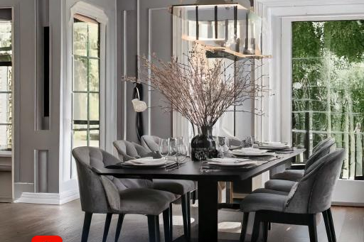
- Why It Works: A soft gray façade looks refined and chic, especially when outlined with bold black trim. The stark contrast highlights architectural details.
- Finishing Touches: Incorporate silver or stainless-steel fixtures for a sleek, contemporary look.
10. Warm Beige & Chocolate Brown
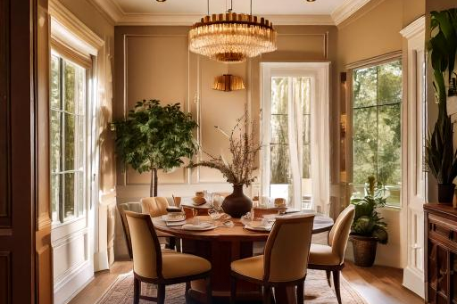
- Why It Works: This inviting combination gives a cozy, sophisticated aura. The beige base is neutral yet welcoming, and the dark brown trim or shutters add depth and definition.
- Finishing Touches: A wooden front door or bronze light fixtures can tie everything together.
11. Dusty Blue & White
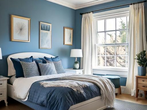
- Why It Works: Dusty blue has a slightly weathered, vintage feel that pairs effortlessly with fresh white trim. It’s a great option for coastal or cottage-style homes.
- Finishing Touches: Accent with natural wood or nautical-themed hardware to enhance the breezy look.
Read More: Guide for Bed Direction as Per Vastu
12. Bold Black & Redwood
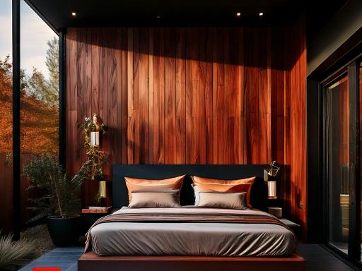
- Why It Works: Sleek black exteriors have become a modern trend, and a warm, redwood accent (often used for siding or a single wall) breaks up the darkness beautifully.
- Finishing Touches: Choose black trim to maintain consistency, or go with a copper finish for fixtures to add an unexpected focal point.
13. Stone Gray & Warm White
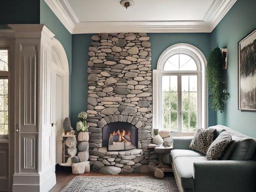
- Why It Works: This combo leans more earthy than typical grays, making the house feel grounded. A warm white trim prevents the design from feeling too cold or stark.
- Finishing Touches: Use stone veneer on pillars or lower walls for added texture that plays nicely with the gray tones.
14. Blush Peach & Off-White
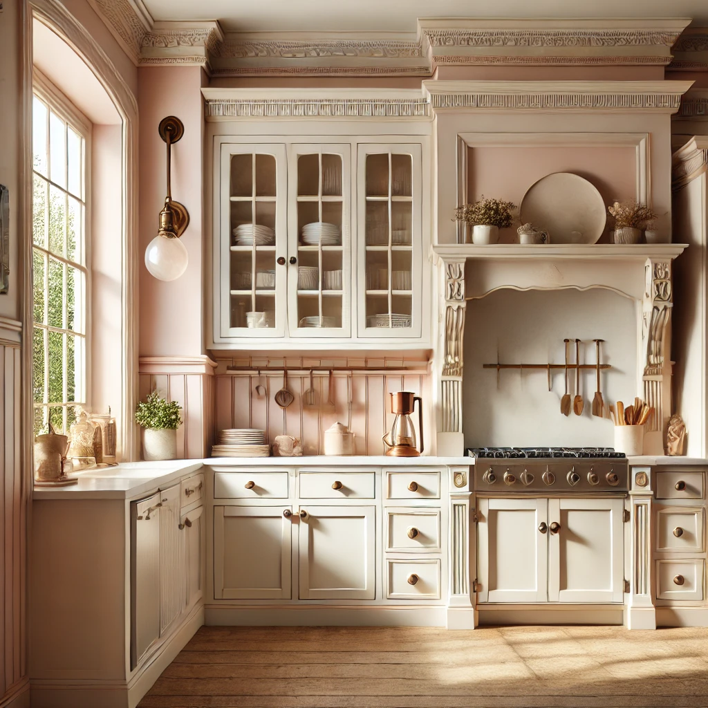
- Why It Works: Soft, subtle, and slightly romantic—peachy exteriors paired with off-white trim evoke a cozy, gentle atmosphere. Perfect for Craftsman or bungalow-style homes.
- Finishing Touches: Consider decorative corbels or vintage porch lights to continue the warm, welcoming vibe.
Read More: Purple Two Colour COmbination Ideas
15. Olive Green & Ivory
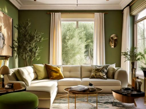
- Why It Works: Olive green is earthy yet bold, while ivory trim softens the palette. This scheme is especially flattering in regions with lush landscapes.
- Finishing Touches: Metallic accents in brass or gold add a luxurious edge to the natural palette.
16. Light Tan & Deep Teal
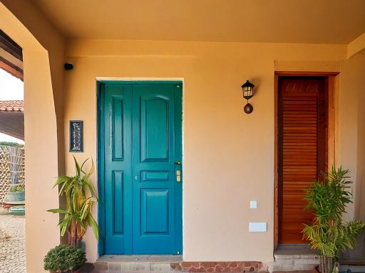
- Why It Works: A sandy tan creates a neutral backdrop that makes a rich teal pop. Using teal as an accent on shutters, doors, or trim works beautifully for a vibrant yet balanced look.
- Finishing Touches: Complete the ensemble with terracotta roof tiles or earthy landscaping features.
17. Eggshell White & Pastel Pink
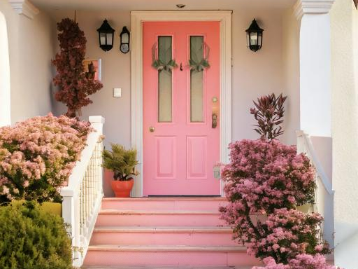
- Why It Works: A nearly white eggshell façade is clean, simple, and timeless. Throw in a pastel pink trim or front door to add a playful twist, perfect for cottage or vintage-inspired homes.
- Finishing Touches: Delicate floral landscaping or a picket fence can tie in the whimsical element.
Also Read: Elegant Pink Two-Colour Combinations for Bedroom Walls
18. Classic Red Brick & Black Trim
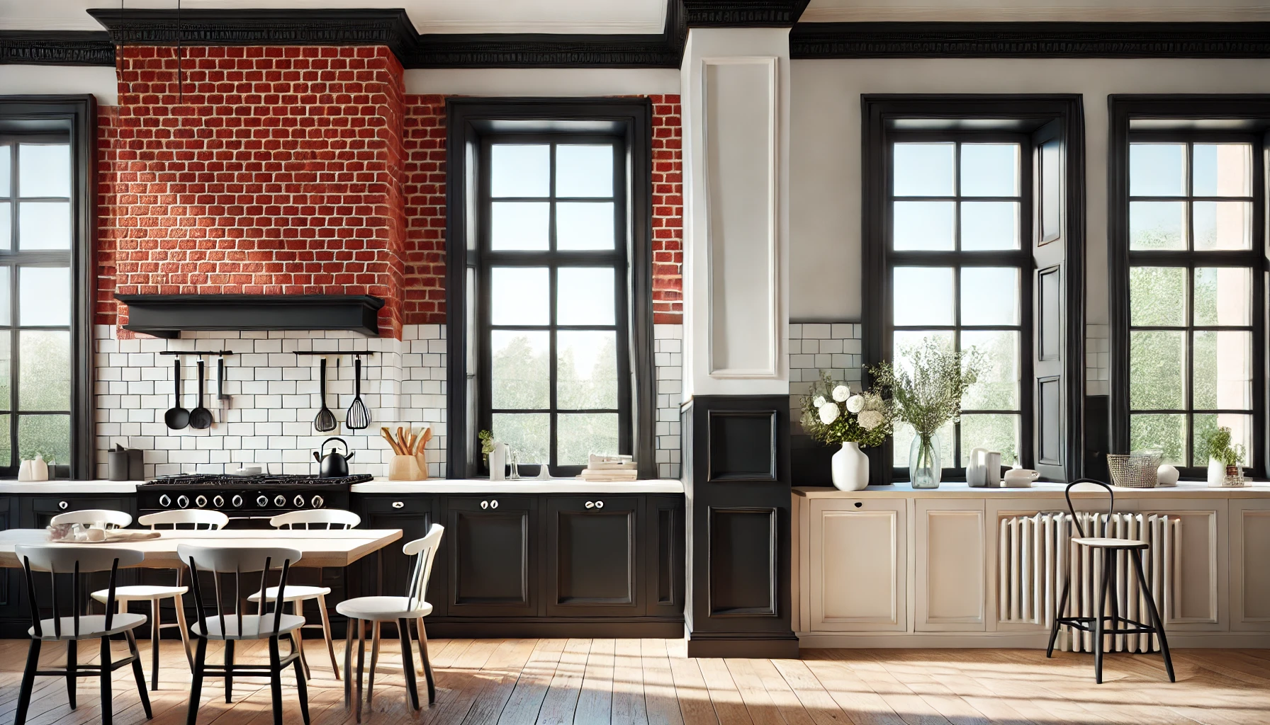
- Why It Works: If your home already has red brick, highlight it with black trim for timeless elegance. The black outlines windows and doors with a sharp, eye-catching detail.
- Finishing Touches: Use lighter landscaping elements (like white flowers or pale stones) to keep the exterior feeling fresh and balanced.
19. Graphite & Mustard
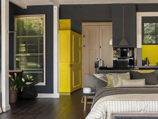
- Why It Works: For a contemporary, edgy statement, paint the main exterior in a dark graphite gray and use mustard yellow sparingly on front doors, shutters, or other small architectural features.
- Finishing Touches: Keep the rest of the trim in white or black for a crisp, modern contrast.
20.Chocolate Brown & Moss Green
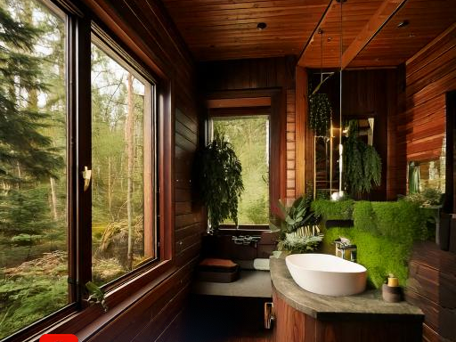
- Why It Works: Dark brown walls exude an air of stability, and moss green trim offers a nature-inspired complement. This palette is excellent for cabins or homes tucked into wooded areas.
- Finishing Touches: Wooden or stone walkways enhance the organic feel.
Read More: Vastu Tips for Attached Bathroom and Toilet
Conclusion
Don’t be afraid to experiment. Colours are ever-evolving, and so is your home. Feel free to refresh your palette as your tastes and lifestyle change. After all, a home is a living canvas, reflecting who you are at every stage of life.
Frequently Asked Questions
Start by considering the dominant colour of your furniture. Use a colour wheel or an online colour-matching tool to find complementary or analogous shades that enhance the existing tones.
Absolutely! A mix of warm (reds, yellows, oranges) and cool (blues, greens, purples) can create beautiful contrast. The key is to balance them so one family doesn’t overpower the other.
Yes, neutrals like beige, grey, and white remain timeless. However, modern trends often involve pairing neutrals with vibrant accents—like mustard yellow or emerald green—for added personality.
Not necessarily. Consistency and flow are important, but each room can have its own character. Try using complementary palettes or a unifying accent colour to maintain harmony throughout.
Light, cool colours (like soft blues and pale greens) can make a small room appear larger. You can also add mirrors and strategic lighting to enhance the sense of space.

 HDFC Home Loan
 SBI Home Loan
